Artismo.
Built for the Drop
Define the Artist
We treat every release like a premiere, because that’s exactly what it is.
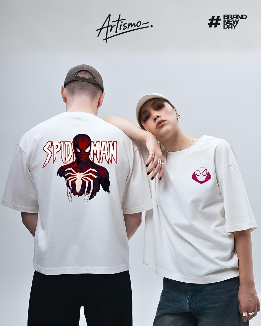
Artismo started with one idea: streetwear built around licensed pop-culture drops deserves the same weight as the releases it’s tied to. No clip-art graphics, no watered-down prints - just oversized, heavyweight cotton carrying screen-accurate art, dropped the same week the story does.
Our first collection, #BrandNewDay, is Artismo’s first licensed run: hero graphics and the classic box-logo wordmark, cut for the street rather than the poster. The ticket-stub details and premiere framing across the site aren’t tied to one film - it’s how we treat every drop, because a release day should feel like an event. Every future collab gets its own campaign name, its own visual language, its own reason to show up opening week. #BrandNewDay is this drop’s story, not ours forever.
What stays constant is the fit, the print quality, and the voice: hype, a little cinematic, always fan-first. T-shirts are live now. Trousers, hats, and accessories are already on the roadmap for the collabs after this one.
Motifs We Build With
Web Linework
Radial web patterns pulled straight from the source material, used as dividers and background texture across every touchpoint.
Motion Streaks
Comic-style speed lines borrowed from the climbing prints - a visual shorthand for movement, urgency, drop-day energy.
Box Logo Treatment
The chunky wordmark-in-a-box, our reference for how category tags and sale badges get built across the site.
Street-Level, Not Studio-White
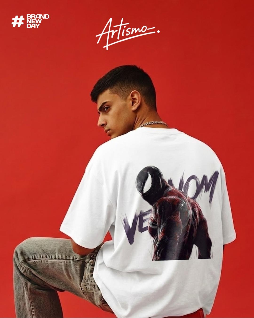
Every shoot happens on concrete, in stairwells, against graffiti and golden-hour skylines - occasionally against a single saturated color when a design calls for it, like the Venom red backdrop. High contrast, warm skin tones, cool backgrounds. No white-cyc catalog shots unless it’s a size-chart detail crop.